THE OTHER FATHER OF OZ
by Michael Gessel

Originally published in The Baum Bugle, vol. 36, no. 2 (Autumn 1992), pgs. 3–4
Citations
Chicago 17th ed.:
Gessel, Michael. “The Other Father of Oz.” Baum Bugle 36, no. 2 (1992): 3–4.
MLA 9th ed.:
Gessel, Michael. “The Other Father of Oz.” The Baum Bugle, vol. 36, no. 2, 1992, pp. 3–4.
The wonderful series of Oz books sprang from the fertile imagination of L. Frank Baum. However, the first Oz book, The Wonderful Wizard of Oz (1900), was the creation of both Baum and illustrator W.W. Denslow. The book was copyrighted jointly with royalties shared equally between the two men. The handsome appearance of the first edition of the book owes more to Denslow than to Baum, and until the release of the 1939 MGM film, Americans thought of the Scarecrow, Tin Woodman, and Cowardly Lion in the images that Denslow drew. It is highly appropriate that this issue of The Baum Bugle is dedicated to William Wallace Denslow, the other father of Oz.
The first collaboration between Denslow and Baum, Father Goose: His Book (1899), was a surprise best seller. Baum had published only one children’s book before, Mother Goose in Prose (1897), which had not sold especially well. Though Denslow was a well-established illustrator at the time, this was his first children’s book.
The following year, Baum and Denslow collaborated on The Wonderful Wizard of Oz. Douglas G. Greene and Michael Patrick Hearn described the interaction between the two men: (W.W. Denslow, Mount Pleasant, Michigan: Clarke Historical Library, Central Michigan University, 1976):
Baum and Denslow had worked closely together to produce The Wonderful Wizard of Oz, and there seem to have been fruitful interchanges of compliments and criticism. As Baum discussed the story with Denslow, the illustrator may have suggested a few of the plot elements and the development of the characters.
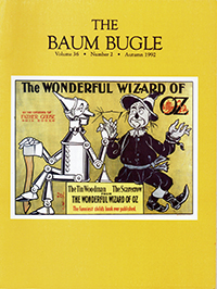
The Denslow illustrations gave form to Baum’s characters. Denslow’s creativity particularly stands out in his delightful interpretation of the nonhuman characters of the Scarecrow, Tin Woodman, and Cowardly Lion. He established the appearance of Dorothy, Glinda the Good Witch, the humbug Wizard, and many of the other Oz characters. He gave life to the houses in Oz by drawing them with faces. His illustrations individually and collectively established a mood that supplemented Baum’s text.
Denslow applied just the right touch of whimsy to his drawings. Scenes such as the field mice pulling the Cowardly Lion are comical, yet not slapstick. Such humorous touches are repeated over and over. Denslow achieved Baum’s aim, stated in his introduction, to create a modern fairy tale, “in which the wonderment and joy are retained and the.heartaches and nightmares are left out.” Even in the more frightening episodes—a wildcat chasing the Queen of the Field Mice or the Wicked Witch calling on the King of the Winged Monkeys—Denslow uses humor to defuse the nightmare.
Denslow varied the placement of the text illustrations to create a surprise on every page. Each page became a frame for Denslow’s illustrations, with the words of the printed text serving as one element of the design. Some drawings would fit into a corner, with the text dodging the outlines of the art; the edges of other drawings would melt into the printed page. Still other drawings would fill the entire page, the text flowing over the image. Most delightful of all were the magnificent illustrated spreads that filled both facing pages, the image dancing back and forth from page to page. These broad friezes of color even obscured the text and pulled the viewer into the book.
Yet there was also a consistency to the design: Each chapter was preceded by a full page illustration and a hand-lettered chapter title. Each chapter began with a headpiece that included the first word boldly lettered in Denslow’s distinctive style which further unified the appearance of the book. The same style of lettering was used on the cover and the tide page.
Color was everywhere! The text illustrations followed the color scheme of the book. For example, because blue was the favorite color of the Munchkins, the images of the Munchkin country were in blue. The images of the Emerald City were green and the images of the Winkies were yellow, their favorite color. Even the four-color plates retained this scheme, with the appropriate color dominating the background. Denslow used rectangular blocks of color to highlight the characters, creating a stage for them. These blocks made the pages even more colorful, adding to the surprise and delight of the book.
Denslow was more than an illustrator of The Wizard—he designed a complete book with coordinated covers, endpapers, text illustrations, chapter headings, and color plates. The result is a stunning book even by today’s standards. It’s not hard to imagine how it must have impressed the book buyers of 1900 who had never before seen anything like it. For the next decade, children’s book publishers were still trying to imitate the appearance and mood of The Wizard in the hopes of capturing some of its success.
The Baum-Denslow collaboration has been compared to the collaboration between Lewis Carroll and John Tenniel, and critics have said that Denslow’s illustrations are as much a part of The Wizard as Tenniel’s illustrations are inseparable from the Alice stories.
There is no doubt that Denslow’s illustrations were a major factor in the early success of the book. Many early reviews of The Wizard singled out Denslow’s contribution for special praise; some even complimented the illustrations over the text. The Chicago Evening Post, September 24, 1900, said, “Mr. Baum has written by far his best book, and Mr. Denslow has illustrated it in a way that is more than half the battle for success . . . If the author’s hand had anything like the boldness, drollery, and picturesque touch of the artist’s the book would be even more satisfactory.”
The Montreal Gazette, December 31, 1900, said, “[I] is the great children’s book of the season . . . But Denslow’s illustrations are the features of the book. Such weird and wild combinations of color have rarely been witnessed before. There are red, green, and yellow figures, and wonderful combinations of all these colors mixed up in splendid confusion.” (For more on early reviews of The Wizard, see “Oz Under Scrutiny,” The Baum Bugle, Spring 1978.)
Beginning with The Marvelous Land of Oz (1904), John R. Neill became the Royal Illustrator of Oz. He developed his own image of the Oz characters distinct from Denslow’s. Still, it was Denslow’s images of the Scarecrow, Tin Woodman, and Cowardly Lion chat stayed with the public. The Denslow Oz characters were used in the 1908 Mardi Gras parade float, on the 1921 Parker Brothers game board, and on a set of notecards issued in 1925 by White & Wyckoff. The Denslow images of the Scarecrow and Tin Woodman were also used in connection with the Century of Progress exhibition in Chicago in 1933.
Even the early tie-in merchandise for the 1939 MGM film used Denslow’s concepts of the Oz characters. Because it was not clear that the film would be a hit, merchandisers may have chosen to use the more familiar Denslow characters, which would have drawing power regardless of the success of the movie. Among the merchandise issued at this time, Oz valentine cards, a dart board, and several booklets used characters close to the Denslow images.
Though Denslow embarked on several Oz-related projects, they were short-lived and his connection with Oz continued only as long as The Wizard was published with his illustrations. However, the delicate colors of the first edition were substituted with harsher tones in the reprints published by The Bobbs-Merrill Company beginning in 1903. Later, the color scheme was altered, then the color text illustrations were dropped entirely. Some of the plates were also dropped. Those that were retained were printed using different, less attractive, colors from the original. In the last Bobbs-Merrill editions illustrated by Denslow the plates appeared completely drained of their original, vibrant color.
After the 1939 MGM film, in the mind of the public Dorothy became Judy Garland, the Scarecrow became Ray Bolger, and the Tin Woodman became Jack Haley. In 1944, Bobbs-Merrill, which still retained the publication rights to The Wizard, brought out a new version illustrated by Evelyn Copelman. Bobbs-Merrill paid obligatory homage to the venerable Denslow illustrations with a note on the title page and the front cover of the dust jacket that the Copelman illustrations were “adapted from the famous pictures by W.W. Denslow.” However, there was really little similarity. If the Copelman illustrations drew inspiration from any source, it was the MGM film.
In recent years, prominent artists have tried their hand at illustrating the text, just as the Alice books have attracted many of the great illustrators. Among the recent illustrators of The Wizard have been Michael Hague, Charle! Santore, Barry Moser, and Greg Hildebrandt. The adaptability of the text to such divergent styles is a testament to the greatness of Baum’s writing. Yet, there always seems to be something missing in these illustrators. Perhaps they were not imbued with the same spirit that filled Denslow when he worked closely with Baum in the creation of the text.
Today, Baum’s first Oz book is enshrined as a classic of children’s literature, though most editions no longer carry the original Denslow illustrations. Still, it is fitting to remember Denslow for his pivotal role in the creation of the book. Denslow’s collaboration with Baum on Father Goose: His Book paved the way for The Wizard; Denslow’s contributions to the story of The Wizard, though undocumented, may have been important; and his illustrations for The Wizard were probably the most significant factor in the critical early sales of the book. Without Denslow, there just might not have been an Oz.
Authors of articles from The Baum Bugle that are reprinted on the Oz Club’s website retain all rights. All other website contents Copyright © 2023 The International Wizard of Oz Club, Inc. All Rights Reserved.
